AD/AS Model
Loading interactive graph...
Aggregate demand, short-run and long-run aggregate supply, and output gaps.
Think you know when each curve moves? Try the draw-the-graph FRQ drills and get graded on it.
Teaching AP Econ? Assign a graded ad/as model activity to your class, auto-graded, scores in your gradebook.
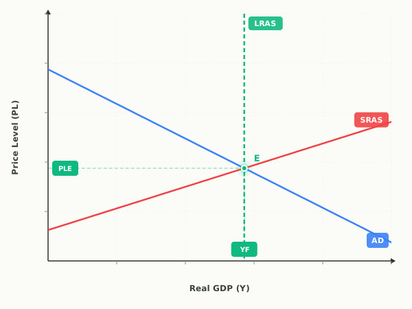
What this graph shows
The aggregate demand and aggregate supply model is the core macroeconomic diagram in AP Macro. It puts the whole economy on one graph: aggregate demand (AD) captures total spending by households, firms, government, and foreigners, while short-run aggregate supply (SRAS) captures total production when input prices are sticky. Long-run aggregate supply (LRAS) is a vertical line at the economy's full-employment level of output.
Equilibrium output relative to the LRAS line is the output gap. To the right of LRAS the economy overheats in an inflationary gap; to the left it runs a recessionary gap. The preset shocks let you fire a government spending increase, a rate hike, a supply chain crisis, or a productivity boom and watch which curve moves and where the economy lands.
How to read it
The horizontal axis is real GDP (total output) and the vertical axis is the price level, not the price of any single good. AD slopes down, SRAS slopes up, and LRAS is the vertical line marking full-employment output. Short-run equilibrium is where AD crosses SRAS, fixing both the price level and real GDP. Compare that quantity to the LRAS line: to the right is an inflationary gap, to the left a recessionary gap, and on the line long-run equilibrium.
Three things to try
- Apply the Supply Chain Crisis shock and watch SRAS shift left. The price level rises while real GDP falls at the same time, the textbook picture of stagflation that a demand shift alone cannot produce.
- Shift AD right until equilibrium passes the LRAS line. The gap readout flips to Inflationary and the price level climbs, showing why demand-driven booms create inflation pressure.
- Apply the Productivity Boom shock to move SRAS right. Real GDP rises and the price level falls together, the one combination that lowers inflation and raises output at once.
Common questions
What is the difference between SRAS and LRAS?
SRAS slopes upward because input prices like wages are sticky in the short run, so higher prices raise production. LRAS is vertical at full-employment output because in the long run wages and input prices fully adjust, so total output depends on resources and technology, not the price level.
What causes an inflationary gap in the AD/AS model?
An inflationary gap happens when short-run equilibrium output lands to the right of the LRAS line, usually after AD shifts right from more spending, investment, or expansionary policy. Output is temporarily above full employment, pushing the price level up until wages rise and SRAS pulls it back.
Does the price level axis measure the price of one good?
No. The vertical axis is the aggregate price level for the whole economy, like the GDP deflator or CPI, not the price of a single product. A rising price level means broad inflation across all goods and services.
Watch a shock move this graph, step by step
- Negative Demand Shock and Long-Run Self-CorrectionA fall in aggregate demand causes a recession, then falling wages restore full employment at a lower price level.
- Positive Demand Shock and Long-Run Self-CorrectionA surge in aggregate demand overheats the economy, then rising wages return output to full employment at a higher price level.
- Adverse Supply Shock and the Stagflation DilemmaA sudden rise in input costs shifts SRAS left, causing stagflation and a policy dilemma with no clean fix.
- A Housing Boom and the Wealth EffectRising home values make households wealthier, so consumer spending rises and AD shifts right, which is a shift of AD rather than a movement along it.
- A Strong Dollar Opens a Recessionary GapAn appreciating dollar cuts net exports, shifting AD left and opening a recessionary gap.
- World Oil Prices CollapseA collapse in world oil prices cuts production costs, shifting SRAS right so the price level falls and real GDP rises.
- Wages Rise Across the EconomyAn economy-wide rise in nominal wages raises production costs, shifting SRAS left and producing cost-push inflation.
- Long-Run Growth: Capital and TechnologyBetter technology and more capital raise productivity, shifting LRAS and SRAS right together so output rises and the price level falls.
- An Income Tax Cut Lifts ConsumptionLower income taxes raise disposable income and consumer spending, shifting AD right and opening an inflationary gap.
- Drought Destroys Productive CapacityA multi-year drought destroys resources, shifting LRAS and SRAS left together so the price level rises and potential output itself falls.
Put it on your own page: the AD/AS Model embed, one line of HTML for a class site or LMS.
Print it: AD/AS Model drawing worksheet, the same shocks on blank axes, with an answer key.
AD/AS Model: key terms
Full glossary →⧉ Embed this AD/AS Model graph on your site
Free to use on any website or class page. Copy the code below, it shows the live, interactive graph and credits EconLearn with a link back.