Consumer Choice Graph
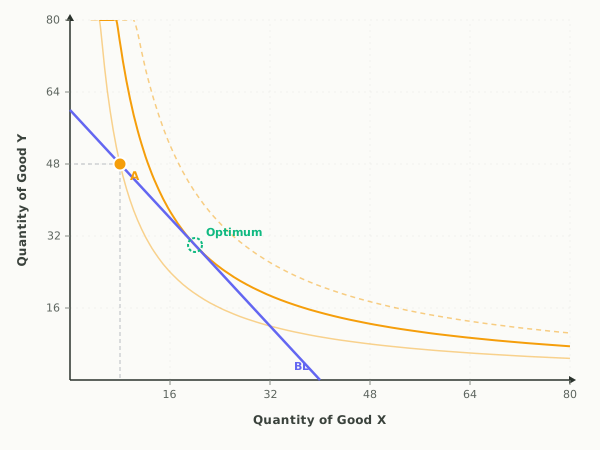
This is the consumer choice model: the budget line from the budget constraint sandbox plus indifference curves, the map of the consumer's preferences. Each curve collects every bundle giving the same total utility, and the consumer's best affordable bundle sits where the highest reachable curve just touches the budget line. At that tangency the marginal rate of substitution equals the price ratio, which is the same condition as the utility-maximization rule MUₓ/Pₓ = MUᵧ/Pᵧ.
Indifference curves, the budget line, and the utility-maximizing bundle at the tangency.
Full guide: The utility maximization rule, worked in a table
Teaching AP Econ? Assign a graded consumer choice activity to your class, auto-graded, scores in your gradebook.
What this graph shows
The interactive keeps bundle A on the budget line so the only question is where along the line to sit. Drag A and watch its utility against the best possible, read the hint that says which good deserves the next dollar, and press Jump to optimum to land on the tangency. Sliders move income, both prices, and the consumer's preference weight for Good X.
How to read it
Quantity of Good X is on the horizontal axis and Good Y on the vertical. Three amber curves show the preference map: a faint one through A when A is not optimal, a solid one tangent to the budget line at the optimum, and a dashed one beyond the line that no affordable bundle can reach. Bundle A turns green at the optimum and amber elsewhere, and the readout compares the marginal rate of substitution at A with the price ratio. When the two are equal, the last dollar spent on each good buys the same utility, and no move along the line can do better.
Three things to try
- Drag A along the budget line away from the tangency and watch its utility fall below the best possible while the hint tells you which direction to slide back.
- Press Tastes shift toward X and notice the budget line does not move at all: preferences reshape the curves, so the tangency lands farther right and 70 percent of spending goes to X.
- Press Price of X falls, then Jump to optimum, and compare the new bundle with the old one to see the substitution and income effects both pulling toward more X.
Common questions
Why is the best bundle where the indifference curve touches the budget line?
Any other affordable bundle sits on a lower indifference curve, meaning less utility for the same income. At the tangency the marginal rate of substitution equals the price ratio, so the consumer's willingness to trade Y for X exactly matches what the market requires, and no swap along the line can raise utility.
What do the three indifference curves on the graph mean?
The solid curve tangent to the budget line is the highest utility the consumer can afford. The faint curve through bundle A shows the utility of the current choice when it is not optimal. The dashed curve past the budget line represents a utility level no affordable bundle reaches with this income and these prices.
Do I need indifference curves for AP Microeconomics?
The AP course tests the utility-maximization rule, spending so the marginal utility per dollar is equal across goods, rather than indifference curves themselves. This graph shows both: the tangency is the picture, and the readout underneath states the same condition as MUₓ/Pₓ = MUᵧ/Pᵧ, so you can connect the college diagram to the AP rule.
Put it on your own page: the Consumer Choice embed, one line of HTML for a class site or LMS.
Consumer Choice: key terms
Full glossary →⧉ Embed this Consumer Choice graph on your site
Free to use on any website or class page. Copy the code below to show the live, interactive graph. The credit line at the end is optional.
Last updated