Monopoly
Loading interactive graph...
Single-firm pricing, MR below demand, and deadweight loss.
Teaching AP Econ? Assign a graded monopoly activity to your class, auto-graded, scores in your gradebook.
What this graph shows
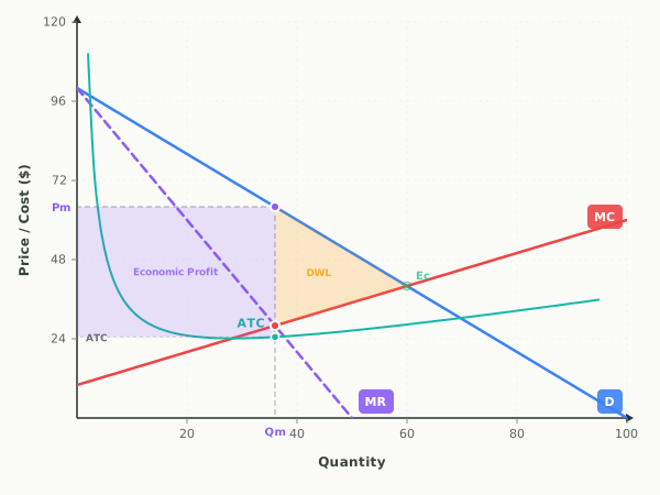
This is the single-firm monopoly model, showing how a price maker chooses output differently from a competitive market. The downward demand curve is the firm's own demand, the dashed marginal revenue curve sits below it, the marginal cost curve rises, and the U-shaped average total cost curve shows per-unit cost.
The interactive lets you drag the demand and cost curves directly, or use the sliders to change the Demand Intercept and MC Intercept. As you do, the graph recomputes the profit-maximizing quantity, the price the monopoly charges, its economic profit or loss, and the deadweight loss triangle that measures the efficiency the market gives up compared with perfect competition.
How to read it
Price and cost are on the vertical axis, quantity on the horizontal. Solve in two steps: first locate where marginal revenue equals marginal cost, marked by the dot on the MC curve, and drop straight down to read the profit-maximizing quantity Qm. Then go up from Qm to the demand curve and across to the y-axis for the monopoly's price Pm. The shaded rectangle between price and average total cost is economic profit, and the amber triangle out to the competitive point Ec is deadweight loss.
Three things to try
- Drag the Demand Intercept slider higher and watch both the profit-maximizing price and the profit rectangle grow as demand strengthens.
- Lower the MC Intercept slider and watch the profit-max quantity increase; raise it and watch the deadweight loss triangle shrink.
- Compare the purple Pm on the y-axis with the green competitive point Ec, and confirm in the comparison box that the monopoly charges a higher price and sells less than competition would.
Common questions
How do you find the monopoly price and quantity on the graph?
Set quantity where marginal revenue equals marginal cost, then go up to the demand curve to find the price. Quantity comes from the MR equals MC dot, and the price is read off the demand curve directly above that quantity, never off the MR curve.
Why does a monopoly produce where MR equals MC and not where price equals MC?
Producing where marginal revenue equals marginal cost maximizes profit because past that point each extra unit adds more cost than revenue. Price is then set higher by reading up to the demand curve, which is why monopoly output is lower and price is higher than in competition.
What does the deadweight loss triangle on a monopoly graph mean?
The amber triangle shows the mutually beneficial trades that never happen because the monopoly restricts output below the competitive quantity. It measures the total surplus lost to society from monopoly pricing.
Put it on your own page: the Monopoly embed, one line of HTML for a class site or LMS.
Monopoly: key terms
Full glossary →⧉ Embed this Monopoly graph on your site
Free to use on any website or class page. Copy the code below, it shows the live, interactive graph and credits EconLearn with a link back.