Production Possibilities
Loading interactive graph...
Opportunity cost, efficiency, and economic growth on the PPC.
Think you know when each curve moves? Try the draw-the-graph FRQ drills and get graded on it.
Teaching AP Econ? Assign a graded production possibilities activity to your class, auto-graded, scores in your gradebook.
What this graph shows
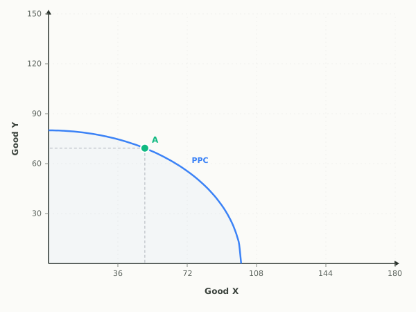
This is the production possibilities curve, the model of scarcity, trade-offs, and opportunity cost using two goods. The bowed-out curve shows every combination of Good X and Good Y an economy can produce when it uses all of its resources efficiently, and its outward bow reflects increasing opportunity cost as you specialize in one good.
Point A starts locked to the PPC, so you can drag the point along the frontier or shift the entire frontier without losing the efficient allocation. Turn the lock off, or choose Inside or Outside, to place the point freely. The point changes color to tell you whether that combination is efficient, attainable but wasteful, or impossible. The Inward and Outward buttons model economic growth or decline.
How to read it
Good X is on the horizontal axis and Good Y on the vertical. Any point on the curve is efficient and turns green. A point inside turns amber, attainable but leaving resources idle. A point beyond the curve turns red, unattainable with current resources. The status readout confirms which case you are in. The stacked ΔY over ΔX fraction shows the PPC slope for one additional unit of Good X, and its absolute value is the opportunity cost in Good Y.
Three things to try
- Click the Inside preset and watch the lock turn off and point A turn amber, showing a combination that wastes resources because the economy could produce more of both goods.
- Lock point A to the PPC, drag it from the top toward the right, and read the ΔY/ΔX fraction becoming steeper as opportunity cost rises.
- Press the Outward button to shift the whole frontier out, then place a previously red, unattainable point and see it become reachable after growth.
Common questions
What do points on, inside, and outside the PPC mean?
A point on the curve is efficient, using all resources fully. A point inside is attainable but inefficient, leaving resources unused. A point outside is unattainable given current resources and technology. The point changes color to green, amber, or red to show which you have chosen.
Why is the production possibilities curve bowed outward?
The outward bow shows increasing opportunity cost. As you move resources toward one good, you have to give up more and more of the other because resources are not equally suited to both goods, which you can see as the opportunity cost value rising along the curve.
How does economic growth show up on a PPC?
Economic growth shifts the entire curve outward, so combinations that were once unattainable become reachable. Use the Outward button to model growth from more resources or better technology, and the Inward button to model decline.
Watch a shock move this graph, step by step
- A Technology BreakthroughA new production process raises productivity in both industries, shifting the whole production possibilities curve outward.
- A Decade of Building CapitalYears of choosing capital goods over consumption add to the economy's resources, shifting the frontier outward.
- An Earthquake Destroys FactoriesA natural disaster wipes out factories and infrastructure, so the economy loses resources and the frontier shifts inward.
- The Labor Force ExpandsPopulation growth and immigration add workers, a resource increase that shifts the frontier outward.
Put it on your own page: the Production Possibilities embed, one line of HTML for a class site or LMS.
Print it: Production Possibilities drawing worksheet, the same shocks on blank axes, with an answer key.
Production Possibilities: key terms
Full glossary →⧉ Embed this Production Possibilities graph on your site
Free to use on any website or class page. Copy the code below, it shows the live, interactive graph and credits EconLearn with a link back.