Supply and Demand
Loading interactive graph...
Shift curves, set price floors and ceilings, and apply economic shocks.
Think you know when each curve moves? Try the draw-the-graph FRQ drills and get graded on it.
Teaching AP Econ? Assign a graded supply and demand activity to your class, auto-graded, scores in your gradebook.
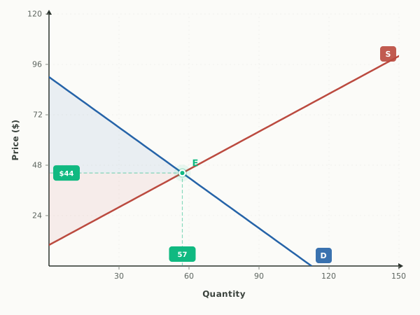
What this graph shows
This is the core supply and demand model, the market diagram nearly every intro economics unit builds on. The blue demand curve slopes down and the red supply curve slopes up, and where they cross is the market equilibrium, the one price and quantity where the amount buyers want equals the amount sellers offer.
The interactive lets you drag either curve, or use the arrow buttons to shift Demand and Supply left or right. You can flip on a price floor or price ceiling and drag it to a level, turn on a Movement Along Curve tool to compare quantity demanded and quantity supplied at any price, and apply preset Economic Shocks like Oil Price Spike or Consumer Income Rises to see which curve moves and why.
How to read it
Price is on the vertical axis and quantity on the horizontal. Read equilibrium where the blue demand line and red supply line intersect: trace straight left from that dot for the equilibrium price, and straight down for the equilibrium quantity. The live readout below the graph reports that same P and Q. When a price floor or ceiling is active, the shaded band between the demand and supply lines at that price is the surplus or shortage.
Three things to try
- Click the Oil Price Spike shock and watch the red supply curve shift sharply left (with demand nudging slightly left too), then read the new intersection to confirm price rises and quantity falls.
- Turn on Movement Along Curve and slide the price up above equilibrium, and notice the graph shade a surplus because quantity supplied now exceeds quantity demanded.
- Press the D arrow buttons to shift demand right, then left, and watch equilibrium price and quantity move in the same direction as demand each time.
Common questions
Where is equilibrium on a supply and demand graph?
Equilibrium is the single point where the demand curve and supply curve cross. Trace horizontally from that point to the vertical axis for the equilibrium price, and vertically down to the horizontal axis for the equilibrium quantity.
What is the difference between a shift and a movement along the curve?
A shift moves the entire curve to a new position because something other than price changed, like income or input costs. A movement along the curve is just sliding to a different point on the same curve because the price itself changed, which the Movement Along Curve tool lets you trace directly.
How do you read a shortage or surplus on the graph?
Pick a price and compare quantity demanded to quantity supplied at that price. Above equilibrium you get a surplus because supply outruns demand, and below equilibrium you get a shortage. The tool shades this gap and labels it for you.
Watch a shock move this graph, step by step
- Tea Gets PricierA jump in the price of tea (a substitute) shifts demand for coffee right to a new equilibrium.
- Both Curves Shift: LaptopsRising incomes and better production technology both push the laptop market right, so quantity clearly rises but the price change is ambiguous.
- Coffee Beans Get ExpensiveA rise in the cost of an input shifts supply left, raising price and cutting quantity.
- Printers Get Pricier, Ink SuffersA rise in the price of a complement shifts demand left, lowering both price and quantity.
- An Excise Tax on SellersA per-unit tax shifts supply left by the amount of the tax, raising the price buyers pay and cutting quantity.
- A Subsidy to SellersA per-unit subsidy shifts supply right, lowering the price buyers pay and raising quantity.
- Drought Hits the Wheat CropA weather shock shifts supply left, raising price and cutting quantity, with revenue depending on elasticity.
- New Sellers Enter the MarketMore firms in the market shifts supply right, lowering price and raising quantity.
- A Recession Lifts an Inferior GoodFalling income raises demand for an inferior good, so price and quantity both rise.
- Buyers Expect Prices to RiseAn expected future price rise shifts demand right today, raising price and quantity now.
- Both Curves Shift: Price Is Certain, Quantity Is NotDemand rises while supply falls, so price definitely rises but quantity is indeterminate.
- A Recession Hits a Normal GoodFalling income shifts demand for a normal good left, so price and quantity both fall.
- Corn Pays Better Than SoybeansCorn prices jump, so farmers move acreage out of soybeans and the soybean supply curve shifts left.
- A Beef Boom Hits the Leather MarketRanchers raise more cattle for beef, and because hides come with the beef, the supply of leather shifts right.
- A Town's Population GrowsThousands of new residents move into a region, increasing the number of buyers and shifting housing demand right.
- The Fad FadesTastes turn against a once-trendy product, so demand shifts left and the market shrinks.
- New Safety Rules Raise CostsA regulation forces added testing on every unit produced, raising per-unit costs and shifting supply left.
- Both Curves Shift: Patio FurnitureA recession pushes demand for a normal good left while a cheaper input pushes supply right, so price clearly falls but quantity is indeterminate.
Put it on your own page: the Supply and Demand embed, one line of HTML for a class site or LMS.
Print it: Supply and Demand drawing worksheet, the same shocks on blank axes, with an answer key.
Supply and Demand: key terms
Full glossary →⧉ Embed this Supply and Demand graph on your site
Free to use on any website or class page. Copy the code below, it shows the live, interactive graph and credits EconLearn with a link back.