Fiscal Policy (AD-AS) graph mistakes
4 ways students lose points on this diagram, each taken from a worked free-response scenario. Every entry names the reasoning that causes the error, not just the error, because the wrong answer is usually a sensible thought applied to the wrong curve.
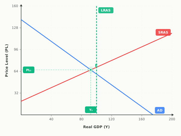
- 01
Highway Program in a Recession: what do students get wrong on the Fiscal Policy (AD-AS) graph?
The mistake. The tempting second shift here is long-run aggregate supply, because a highway is public capital and capital sounds like capacity. Capacity moves only once that capital is finished and carrying traffic, which the stem puts several years out, so nothing Tarnholm spends this year changes its resources or technology. Shifting LRAS now also widens the recessionary gap instead of closing it, because potential output slides right while actual output stays where aggregate demand put it.
Draw this instead. AD shifts right.
Exam tip. Before you touch LRAS, ask whether the new capital is producing anything yet; if the stem says construction has only started, the money spent this year belongs to G and moves AD alone.
Try this one on a live graph - 02
Household Income Tax Increase: what do students get wrong on the Fiscal Policy (AD-AS) graph?
The mistake. A very common wrong answer shifts short-run aggregate supply to the left, because a tax feels like a cost and students remember that higher costs move SRAS. This tax is levied on what households earn, not on each unit a firm produces, so no firm's per-unit cost changes. The SRAS drawing also predicts a rising price level, which is the opposite of what a policy designed to cool inflation is supposed to do, so it fails its own sanity check.
Draw this instead. AD shifts left.
Exam tip. Sanity-check the direction before you move on: a policy meant to cool inflation has to pull the price level down in your drawing, so if the curve you moved pushes it up you shifted the wrong one.
Try this one on a live graph - 03
Per-Unit Tax on Producers: what do students get wrong on the Fiscal Policy (AD-AS) graph?
The mistake. The common wrong answer shifts aggregate demand left, because a tax sounds like less money circulating and the personal income tax students meet most often does move that curve. What the tax is charged on decides which curve moves: this one is charged on each unit a firm produces, so it enters the model as a per-unit cost, while an income tax is charged on what households earn and works through disposable income. The aggregate demand answer also predicts a falling price level, and a tax on every unit produced pushes the price level up.
Draw this instead. SRAS shifts left.
Exam tip. Fiscal policy reaches this diagram two different ways: purchases, transfers, and taxes on income move total spending, while a tax or subsidy attached to each unit produced moves per-unit cost. Decide which of the two the stem describes before you draw anything.
Try this one on a live graph - 04
Benefits Rise as Layoffs Spread: what do students get wrong on the Fiscal Policy (AD-AS) graph?
The mistake. Many students shift aggregate demand left, reading the stem as a recession question and drawing the layoffs a second time. The layoffs are already in the graph by assumption, and the change being asked about is the benefit expansion, which puts spendable income back into households' hands and pulls aggregate demand toward the right. Others leave the graph untouched because transfers are not part of government purchases; transfers still reach aggregate demand through the consumption they finance.
Draw this instead. AD shifts right.
Exam tip. Automatic stabilizers always push against the business cycle, so on a downturn stem decide first whether the question wants the shock or the stabilizer, and shift AD toward the side that cushions the economy.
Try this one on a live graph
Mistakes on the other graphs
- Supply and Demand
- AD-AS Model
- Money Market
- Loanable Funds Market
- Foreign Exchange Market (USD)
- Phillips Curve
- Labor Market
- Production Possibilities
- International Trade
Looking for exam-wide advice rather than one diagram? The ten most common AP Economics exam mistakes covers timing, command verbs, and the errors that are not about graphs at all.
Last updated