Production Possibilities graph mistakes
3 ways students lose points on this diagram, each taken from a worked free-response scenario. Every entry names the reasoning that causes the error, not just the error, because the wrong answer is usually a sensible thought applied to the wrong curve.
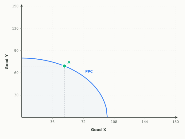
- 01
Automation Lifts Both Industries: what do students get wrong on the Production Possibilities graph?
The mistake. A tempting wrong answer moves the curve inward, on the reasoning that automation replaces workers and leaves the country producing less. Automation here shrinks no resource: the labor force is stated to be unchanged, and each worker now produces more, so the maximum output of both goods is larger and the curve moves outward, not inward.
Draw this instead. The PPC frontier shifts outward.
Exam tip. Count the industries the improvement reaches before you draw: a gain confined to one industry rotates the frontier outward along that good's axis alone, while a gain in both industries moves the entire curve outward.
Try this one on a live graph - 02
Flood Wipes Out Machinery: what do students get wrong on the Production Possibilities graph?
The mistake. A very common error is to leave the curve exactly where it is and mark a point inside it instead, treating the disaster as idle resources. A point inside the frontier means the resources still exist but sit unemployed. Here the machinery is gone for good, so the economy's capacity itself is smaller and only an inward shift of the frontier shows that.
Draw this instead. The PPC frontier shifts inward.
Exam tip. Ask whether the resources still exist; unemployment or inefficiency puts the economy at a point inside an unchanged frontier, while resources destroyed and never replaced move the frontier itself inward.
Try this one on a live graph - 03
A Decade of Building Capital: what do students get wrong on the Production Possibilities graph?
The mistake. Students often answer by picking a different point on the existing curve, one weighted toward capital goods, because that is the choice Verath made each year. That movement along the curve is the choice, not its result: it only shows consumption being given up today. The capital those years produced is what raises capacity afterward, and the question asks for that later effect, which only an outward shift of the whole frontier can show.
Draw this instead. The PPC frontier shifts outward.
Exam tip. Separate the choice from its payoff on an investment question: picking a capital-heavy point is a movement along today's frontier, while the capital that choice builds shows up years later as an outward shift of the entire frontier.
Try this one on a live graph
Mistakes on the other graphs
- Supply and Demand
- AD-AS Model
- Money Market
- Loanable Funds Market
- Foreign Exchange Market (USD)
- Phillips Curve
- Labor Market
- Fiscal Policy (AD-AS)
- International Trade
Looking for exam-wide advice rather than one diagram? The ten most common AP Economics exam mistakes covers timing, command verbs, and the errors that are not about graphs at all.
Last updated